
This sample gives the standard Line Presenter and Options Presenter a pixel-art look. The dialogue panel has a textured brown frame, the text uses the Pixelify Sans font, the continue button is an orange arrow, and each option is marked with a small triangle when it’s selected. None of it needs new Presenter code. The nodes, styles and fonts in the scene do it all.
When you run it, you walk up to Alice and talk to her. She says one line, then offers two options, and replies to whichever one you pick.
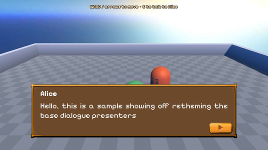
Running it
Open samples/themed_line_presenter/themed_line_presenter.tscn and click Run Current Scene.
- Move with WASD or the arrow keys.
- Press E near Alice to talk to her.
- Press Enter or Space, or click, to show the whole line or go to the next one.
- Click an option, or press Enter or Space to pick the selected one.
How it works
The scene uses the same layout as the other 3D samples. The two Presenters are under UILayer, built from Godot’s own controls and given new styles.
The dialogue
The Yarn Script is short. Talking to Alice runs the Alice node.
title: Alice
---
Player: Hello
Alice: Hello, this is a sample showing off retheming the base dialogue presenters

-> Neat
    Alice: right?
-> Dull
    Alice: rude!
===The Line Presenter
LinePresenter uses themed_line_presenter.gd, which is a YarnLinePresenter with nothing added. It has its own class name, ThemedLinePresenter, so the sample doesn’t depend on the shared Presenter, but it behaves the same as the standard Line Presenter.
The look comes from the scene:
- The panel’s Theme Overrides > Styles > Panel is a
StyleBoxTexturethat usespanel_background.png. Its texture margins are 53 pixels on each side, so the corners of the frame stay the same size however wide the panel gets. Its content margins keep the text clear of the frame and leave room at the bottom for the arrow. CharacterLabeluses Pixelify Sans Bold at size 32.TextLabeluses Pixelify Sans Regular at size 33, with the bold font set for[b]text.ContinueIndicatoris aTextureButton. Its normal and pressed textures are twoAtlasTextureregions ofSprites.png. Its Texture Filter is Nearest, so the pixel art stays sharp when it’s scaled up.- On the Line Presenter itself, Justify Text is on, so each line of text fills the width of the panel.
The Line Presenter’s Text Label, Character Label, Character Container and Continue Indicator are set to these nodes in the Inspector. The Line Presenter shows the continue indicator while a line is on screen, and hides it afterwards, whatever kind of control it is.
ContinueButtonHandler uses the add-on’s line_presenter_button_handler.gd, and its Continue Button is set to ContinueIndicator. It’s listed in the Line Presenter’s Event Handlers, so the Line Presenter tells it when each line starts and ends. It enables the button while a line is on screen and connects the button’s pressed signal to the Dialogue Runner’s request_next_content(), so clicking the arrow goes to the next line.
The Options Presenter
OptionsPresenter uses the standard Options Presenter script. It has the same panel texture as the Line Presenter, with smaller content margins. Show Last Line is on, so Alice’s line stays on screen in LastLineLabel above the options.
Its Option Button Scene is set to the sample’s own option_item.tscn. The root of that scene is a plain Button rather than a YarnOptionItem. When the Options Presenter gets a plain Button, it sets the button’s text, connects its pressed signal, and gives focus to the first button. Because a custom scene is set, it leaves the button’s size and font alone.
The button in option_item.tscn has an empty style for every state, so it looks like plain white text. Its child SelectionIndicator is a TextureRect showing a small triangle from Sprites.png. The button’s focus_entered and focus_exited signals are connected to its script in the scene, so the triangle shows only while the button has focus:
@onready var _indicator: TextureRect = $SelectionIndicator


func _sync_indicator() -> void:
_indicator.visible = has_focus()For more ways to change how options look, see Changing how the buttons look.
Things to try
- Select
OptionsPresenterand turn off Show Last Line. The options appear on their own, without Alice’s line above them. - Select
LinePresenterand turn off Justify Text. Lines that wrap are left-aligned instead of filling the panel. - Change Characters per Second on
LinePresenter. It’s set to 60. A lower number makes the text appear more slowly.